DSAM Seminar


Project Proposal
My main questions going into the course were based around figuring out what the geography of the banana industry was in twentieth century Jamaica and how it was impacted by Panama Disease. One area in particular that I wanted to explore was how mapping the geography and the spread of Panama Disease could help in understanding the factors that led to the spread of the disease. I knew I did not have enough data yet to map the spread of the disease itself, but I knew from some of my previous research that the Handbook of Jamaica, published annually, contained data for banana plantations on the island. With this in mind, I decided that the closest I could come to seeing the spread of Panama Disease was to reverse engineer it, mapping places where banana plantations popped up and disappeared. With the available data on HathiTrust, I decided I wanted to look at 1897, 1907, and 1917, which showed the industry prior to the creation of the United Fruit Company, the industry before Panama Disease, and the industry after planters first discovered the disease on the island.
Iteration One
My first iteration consisted of putting together all of the capta for 1897, 1907, and 1917. This meant downloading the Handbook of Jamaica for each year from HathiTrust, manually entering the plantation name, parish, and number of acres of bananas being cultivated, and then finding the latitude and longitude of each plantation. By far the hardest part of this process was finding the location of these estates. The handbooks only provide the name and parish, with no information about where exactly these were located. I spent quite a bit of time trying different methods to figure out these locations. I ended up using the University College of London’s Legacies of Slave-Ownership website. You can search by estate name and colony and it will show the plantations that match that name, the parish, and then plots the point on an OpenStreetMap inset. The data only runs through emancipation in 1834, but most banana plantations were originally sugar plantations, so I was largely successful in finding the banana plantations through the site.


Iteration Two
This iteration consisted primarily of creating GIS maps based on the capta I gathered in my first iteration. Instead of using ArcGIS, as I did in World History Methods, I chose to use the open source QGIS platform to ensure that I would always have access to it even after leaving Pitt and its free subscription to ArcGIS. Apart from going through some how-to guides and videos online, it did not take much to reorient myself to this different program. As part of mapping the plantations, I decided to include rivers and altitude on my maps to see a more holistic view of Jamaica's physical and built geography. I obtained all of these through DIVA-GIS. Two of these maps are below. Overall, I did not feel that these maps told me much about the spread of Panama Disease, as cases by 1917 were still very low on the island. What this iteration really confirmed for me, apart from that I could successfully use QGIS, was that I needed to obtain data from later years to really see the impacts of Panama Disease. Hathitrust only has the handbooks that are already out of copyright restrictions, meaning that anything post-1922 is not available. I tried to find later versions through EZBorrow, but the handbooks are all held as special collections and therefore I was unable to request them. I then contacted HathiTrust and was told to create a “Capsule,” which could potentially allow me to extract the data through one of the variety of tools included. This led me on the path to my third iteration.


Iteration Three
This ended up being my "exploration" iteration. HathiTrust listed several applications that could be used to take data from their research capsules or to analyze the data within them. These included Voyant, Anaconda, R, Sbt, Scala, Akka, InPHO Topic Explorer, and Apache. I had never used any of these programs, so I devoted the iteration to exploring each of them and determining if they could be used to extract the data I wanted. I started with Voyant and uploaded a PDF to it, which allowed me to see the most frequently used words in the text, segments the work, and shows correlations between them. I then turned to R, a program for statistical computing that requires using a command script. My basic goal with R was to make something work, as I had never really used command scripts before. I tried, and eventually succeeded in creating a bar graph that showed the acreage of banana cultivation by parish. I then turned to Sbt and Scala. I learned that Scala is the programming language used by Sbt, which is used primarily for running tasks in parallel. My "success" with the program was getting it to run a command script saying “Hello world.” From there I built on my learned knowledge of Scala by using the Akka tool, which creates multiple actors using the Scala programming language. After getting its version of “Hello world” to run, it showed up in four different forms, indicating the multiple actors. I ended this tool learning exercise with InPHO Topic Explorer, which shows the main topics of an uploaded text and topic clusters. At the end of the day, none of these tools brought me particularly closer to figuring out how to get my data from Hathitrust, but I learned quite a bit about programming, statistical tools, and topic modeling. Examples of my work in R and Voyant can be seen below.


Final Iteration
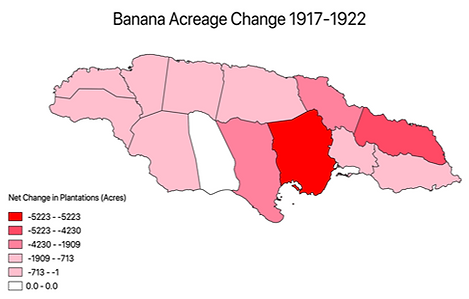
My fourth iteration consisted of figuring out how best to use the data that was available to me. I first decided to compare plantations in 1917 and 1922, with 1922 being the last year of data I could access. It became immediately apparent when comparing the 1917 and 1922 maps that there was a drop off in both the number of plantations and the number of acreage of those still cultivating bananas. Clicking between the 1917 and 1922 data, it appeared that the parishes with the largest drop offs were Portland and St. Catherine.


Having done an eye-test of comparing 1917 and 1922, I went back and analyzed the data itself in Excel to see if the numbers supported what I was seeing. For each of the fourteen parishes, I calculated the net change in the number of plantations as well as the net acreage change between 1917 and 1922. In terms of both number of plantations and acreage, the data supported my eye test. Portland and St. Catherine were the two highest parishes in both net plantation change and acreage change. The change in acreage was particularly striking, as the two parishes each lost more than 2,000 more acres of bananas than any of the twelve remaining parishes. Now that I had this data, I decided to map these changes to see what the geography of the change between 1917 and 1922 looked like. I already had the parish shapefile from my work with the locations of plantations, so I joined my new datasets to that shapefile to provide a parish by parish look at overall changes. Since this data is for the parishes as a whole rather than specific latitudes and longitudes, I chose to represent the data using choropleth maps, with the darker the shade of red meaning a larger drop-off. I created two maps, one for net plantation change, and one for acreage change.

Once I worked through the 1922 data and discovered such a large drop-off in banana production, I decided to try to figure out what, if anything, replaced banana production on the island. In my research, one of the interventions I want to make is connecting the sugar and banana industries in the twentieth century. Most people who write about Jamaica or these commodities in general write about them separately but I want to argue that it was Panama Disease that resulted in a revitalization of the sugar industry in Jamaica, but this time based on smallholder, rather than plantation-based, production. With this in mind, I decided to look at the data for sugar in 1917 and 1922, which was also found in the same handbooks that I used for the banana data. I followed a similar process as I did with the net change in bananas, going parish by parish and seeing how the net acreage of sugar changed between 1917 and 1922. I calculated both net change and percentage change, just to see what I found doing it both ways. Between the two periods, there was a 19,964 acre, or a 59% increase, in sugar acreage across the island. Based off of my focus on St. Catherine and Portland for bananas, I was especially interested to see the data for these two parishes. Unlike bananas, there was a sharp divide between the two in terms of sugar. Portland increased from 172 to 286 acres while St. Catherine jumped from 2,126 to 8,583, a 304% increase. I hypothesized that the difference between the two parishes might be that the infrastructure in Portland was primarily built around the banana industry, was the center of United Fruit Company operations, and held the primary export port. St. Catherine already had pre-existing structures for sugar and coffee, potentially making it easier to send the sugar to Kingston.
As with the banana data, I created choropleth maps to see the geography of sugar from 1917-1922. On their own, neither the banana or sugar maps offer any particularly valuable insights for my main research interests apart from confirming an island-wide decline in bananas and increase in sugar, but I thought that bringing them together would be insightful. The way I first went about this was to create a bivariate choropleth map that brought together banana acreage decline and sugar acreage increase. This meant adding both layers to QGIS and having them active at the same time I used a red scale for bananas and a blue scale for sugar, with the darker red meaning more banana decline and the darker blue meaning larger sugar increases. Making this map confirmed the importance of St. Catherine, but apart from that, I realized that I was making this much too complex and could just compare the data in Excel, as there are only fourteen parishes to look at. Comparing the data in Excel led me to notice that Hanover, in western Jamaica, and St. Mary, in north-central Jamaica, also had large shift from bananas to sugar. Again, these findings themselves did not offer any conclusions, but were useful for my future research in thinking about the relationship between bananas and sugar.


Having done all of this, I went back to my original question of how to use mapping to chart the spread of Panama Disease and some of the reasons behind its spread. The main question I was left with after comparing the 1917 and 1922 data was why St. Catherine had such a large drop-off. Portland made sense since it was the parish where the disease was first discovered, making it ground zero in terms of the potential spread of the disease. St. Catherine, however, is not adjacent to Portland or connected by any rivers. I was not sure why this parish in particular would see such a decline. Looking at the locations where there was the largest decline of plantations, I noticed that a number of plantations that stopped cultivating bananas in St. Catherine were located around the Rio Pedro River. Upon seeing this, I went to the online archive of the Daily Gleaner, Jamaica’s primary newspaper, and keyword search “Rio Pedro River” and “disease” from a period of 1912, when Panama Disease was first discovered on the island, to 1922. I looked through the results and saw that no one seemed to be talking about the river as a site of disease spread.
I then spent some time looking through the data and images I collected as part of my summer research in Jamaica and came across a map of the railroads and mail routes on the island in the early-twentieth century. Looking at the map in relation to the digital maps I made, I discovered that the railroad line ran right through St. Catherine and the area around the Rio Pedro River. Upon seeing this, I searched and found a shapefile for the current railroad in Jamaica. The reason that I had not used this shapefile in my previous iterations was that I was hesitant to apply a contemporary railroad map to the early twentieth century. However, when I eventually did upload this shapefile to QGIS and compared it to the map I found over the summer, I noticed that the rail lines, at least for the eastern parishes, were identical. With the rail lines now in my QGIS maps, I looked around Portland as well to see if there is any seeming correlation between the location of the railroad and the decline of banana plantations. The rail line runs close to the coast in Portland, which is also where the largest decline in banana plantations was, suggesting that there is at least the possibility of some relationship between the two.
Upon seeing this potential relationship between banana decline and the rail lines, I went back to some of the notes I had taken over the summer on the Journal of the Jamaican Agricultural Society, the main agricultural journal on the island. In the 1919 journal, one news bulletin brought up that people needed to stop loading banana trash onto rail cars. The rail companies would use the banana trash as a mat to protect some of the other goods being transported. The bulletin in the journal talked about the frustrations that the rail companies either were not posting these warnings or that people were ripping them down. As the banana trash, not just the plants themselves, were carriers of Panama Disease, there was concern that loading diseased trash onto the rail cars would accelerate the spread of the disease. Based on my preliminary maps, I hypothesized that this in large part accounted for the drop-off in St. Catherine. This insight would play a key role in my dissertation chapter on this time period.